


Introduction
Here begins a series that shares years of experience, late nights, and real battle scars with Power BI. This isn’t a standalone piece, but the first step in a broader series of articles designed to guide you through key aspects of the journey. We start here with the foundations and architecture, setting the fundamentals for everything that follows.
I might sound rough but too many people take a 3-week crash course, drag a few charts into a blank report, and start calling themselves Power BI Experts. Anyone can do that, but let’s be real, that’s just level 0️⃣ of Power BI: a mix of Excel, PowerPoint, and maybe a quick CSV or SharePoint connector. Whether it’s Power BI, Tableau, or even SSRS, the front-end is just an HTML renderer, yeah has to look nice!, but it’s all JSON or binary instructions drawing shapes powered by an architecture you need to truly master.
That’s when the real challenges begin! You need to understand the engine under the hood and the paradigms that keep dashboards fast and your costs under control. So no, this article isn’t about making bookmarks, syncing slicers, or changing colors. We’re diving deep into the fundamentals that actually matter.
Before we dive in, read OLAP and Kimball, and understand star schemas and denormalization. Then get ready: we’re diving into history, memory, connection modes, and cubes ⿻!
Breakdown: What Is Power BI?

Power BI is one of the most widely used data tools today 🔥. Whether you’re in a startup or a big enterprise, everyone wants dashboards, and Power BI is often the first name dropped. Unfortunately, people still see it as a monolithic tool, when it’s actually a multi-layered suite.
Let’s break that down:
- Power BI Desktop: Your local development environment. You build the data model, write DAX, design visuals, and preview reports. It’s like a draft mode.
- Power BI Service: The cloud platform for publishing, refreshing, securing, and sharing. Underlying data can also be stored and processed in cloud memory, with costs depending on capacity.
- Power BI Report Server: Like Power BI Service but on-premise! Ideal for hosting reports and paginated reports in organizations with strict compliance or no-cloud policies.
- Power BI Mobile: App for accessing and interacting with reports directly on mobile devices, with alerts and offline use. In reality, adoption is often low 👎.
- Microsoft Fabric: A full data platform. Power BI is just one part of the whole. Fabric covers ingestion (Dataflows, Pipelines), storage (OneLake, Delta), modeling, and reporting (Power BI is here). It introduces Lakehouse, Warehouse, and Real-Time Hub.
The Old Microsoft BI Stack
To really understand what makes Power BI powerful today, you have to know where it came from. Before the Power BI that we talked about in the last chapter, there were three heavyweight products under the umbrella of MSBI (Microsoft Business Intelligence):
- SSAS (SQL Server Analysis Services): The analytical engine that historically supported MOLAP cubes with pre-aggregated data, and later tabular models powered by VertiPaq.
- SSIS (SQL Server Integration Services): The industrial ETL tool used for moving data between systems, transforming it, and loading it.
- SSRS (SQL Server Reporting Services): The front-end specialized in paginated outputs such as invoices and compliance forms. It was adapted for simple dashboards, often combined with Excel, while many companies also used Cognos, Business Objects or QlikView for broader dashboard experiences.
These tools dominated enterprise BI for over a decade, but they lived in separate silos, each with its own environment. Power BI emerged from this landscape. It brought together the modeling of SSAS, the transformation of SSIS, and the reporting of SSRS into a single platform (well not 100%, SSAS and SSIS survived, but we’ll get into the details later).
1️⃣ The Analytic Engine Evolution
From OLAP Cubes to VertiPaq
Back in the 90s, companies needed Business Intelligence just as much as they do today. They were already making millions in sales and wanted to calculate their profits. So, what’s the core challenge here? A dashboard is dynamic! You need answers instantly (ideally in seconds) when your users are clicking on visuals or changing filters; therefore your data has to be stored in a way that can be fetched and computed extremely rapidly.
Data usually lives in one of two places: disk or memory. Memory (or RAM) is extremely fast (somewhere between 5x and 100x faster than disk) but volatile, while disk (can be HDD/SSD) is slower yet persistent. Picture this: you’ve got 200 million sales records (roughly 20 GB) and you want to build a dashboard on top. If everything sits on disk, then no matter how clever your optimizations are, every time a user clicks around, the system has to filter and calculate across those 200 million rows… which can easily take minutes. So yeah, the obvious move is to go with memory, because speed is king.
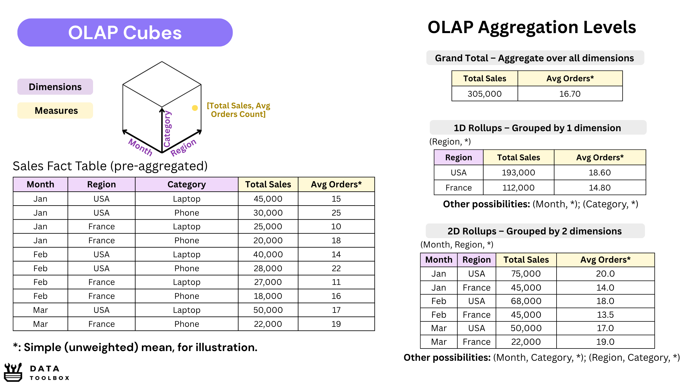
But in the 2000s, memory wasn’t really an option 😬! It was way too expensive and not scalable back then. That’s where SSAS stepped in: it would pre-calculate aggregations (SUM, MAX, and others) across selected dimensional combinations, so when the user clicked, the answer popped up instantly. Think of it as a multi-dimensional pivot table, materialized and saved on disk. Those were the famous OLAP cubes, built in the early versions of SSAS.
But times change. Over the years, memory prices have dropped, opening the door to new approaches. Microsoft introduced VertiPaq, a columnar storage engine (think Parquet-style compression) built for tabular models. Instead of storing pre-aggregated views across every dimension, VertiPaq can calculate results on the fly 🪰, thanks to its highly compressed in-memory format.
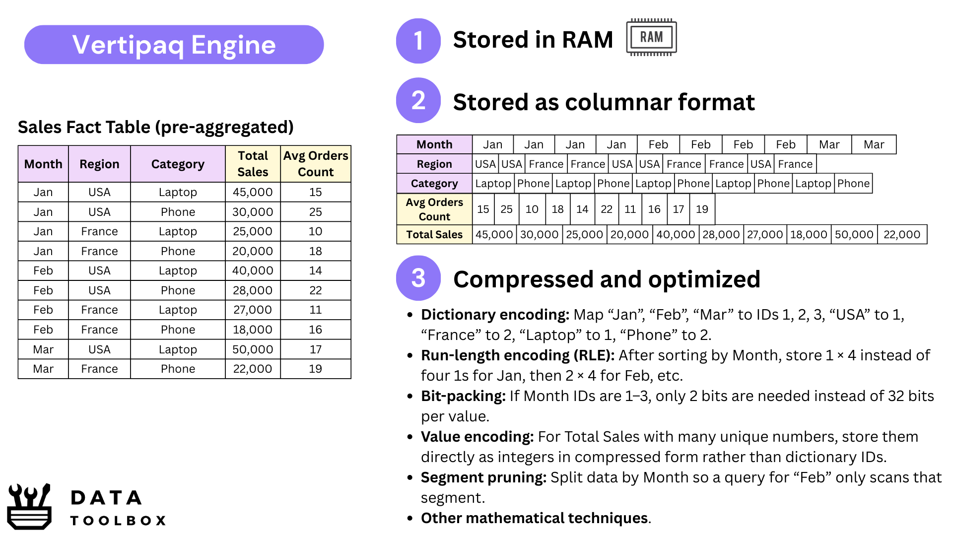
We still sometimes call them “cubes”, but they’re no longer true OLAP cubes. What Power BI actually runs on with VertiPaq are in-memory tabular datasets, often modeled as a Kimball-style star schema or, in some cases, just a massive flat table. In fact, the modeling logic hasn’t changed that much: whether in the old multidimensional OLAP world or today’s in-memory engines, Kimball-style designs remain the backbone, the difference lies in how they’re stored and computed.
To extend this engine to the cloud, Microsoft launched Azure Analysis Services (AAS). Think of it as SSAS without the hardware headaches: instead of setting up and maintaining servers on-premise, you could simply rent dedicated memory in Azure (32, 64 GB, sometimes much more) to host tabular models and serve queries quickly.
From MDX to DAX
Back in the SSAS cube days, the language was MDX. It was powerful, but too complicated, like really bad 🤢.
A simple YTD calculation could look like alien code, and most analysts gave up before even trying. The thing was that MDX was cube-thinking: you had to design in advance what you wanted stored in the cube, define the hierarchies, and then query those pre-calculated structures. It worked, but it was heavy and rigid.
When VertiPaq arrived with in-memory tabular models, everything changed. Unlike MDX, which navigated multidimensional cube structures, DAX could stay simple and declarative: you just define the rule for your measure, and VertiPaq handles the calculation dynamically based on the filter context at query time.
At first sight, DAX looks like Excel formulas… simple, approachable, almost too easy 😂. But the moment you touch CALCULATE, FILTER, or time intelligence, you realize it requires a completely different way of thinking. Like any language, learning DAX is not only about knowing the functions, but about understanding how calculations react to the data currently being evaluated and filtered. Instead of telling the system step by step how to process the tables, you define what the business wants to measure, and VertiPaq computes the result instantly for whatever slice of data the user is exploring.
The objective of this article, and of Datatoolbox as a whole, is not to provide a language tutorial. Thus, you’ll find plenty of DAX tutorials online 😉!
Today’s Fabric Paradigms
🎬 Plot twist: Microsoft isn’t really pushing SSAS or AAS anymore. They’re still around, but let’s be honest, they feel a bit old school. Originally, the split made sense: Power BI focused on ingestion and visualization, while SSAS/AAS handled in-memory storage and modeling. But that separation became redundant once Power BI Service / Report Server started hosting semantic models directly, removing the need for an extra SSAS server or AAS tenant.
Instead of maintaining duplicate services, Microsoft chose consolidation. Today, when you publish to Power BI Service, the semantic model just runs inside Power BI Service, either in shared or dedicated capacity.
Why do that? Because it creates a cleaner architecture, simplifies governance, and ties costs to the capacity you provision.
🎬🎬 The next step is Fabric’s OneLake. Until now, semantic models typically lived either in SSAS on premises, in a provisioned AAS instance in Azure, or directly in Power BI Service as a fully managed cloud semantic model. With OneLake, the architecture changes again: data can remain in Delta format in the lake, and Direct Lake lets Power BI query it without a traditional import while VertiPaq still executes the analytical queries in memory.
Yeah, as you can see, it’s a mess! Companies can choose between four architectures/patterns depending on their strategy, constraints, and existing stack...
2️⃣ The Data Pipeline Evolution
From SSIS to Power Query
SSIS (SQL Server Integration Services) was, and still is, the Swiss Army knife 🇨🇭 of enterprise ETL. A real orchestration engine: scheduling, logging, parallelism, error handling, bulk inserts, Change Data Capture, slowly changing dimensions, integration with queues… the list goes on. It was built for IT teams running industrial pipelines, often moving terabytes overnight from transactional systems into data warehouses or data lakes. Like Talend or Oracle Data Integrator (ODI), it required senior data engineers, because these tools were made for large and complex architectures.

👉 The problem? Analysts couldn’t touch it 😵. With the rise of self-service BI, the gap became obvious: business users needed to shape and combine their own data, without waiting months for IT to provide the right dataset in the right format.
That’s why Power Query was born, first in Excel, then in Power BI. It gave analysts a friendly UI to:
- Connectors: Access hundreds of sources including SQL databases, cloud services, flat files, APIs, SharePoint, and more.
- Transformations: Remove duplicates, split or merge columns, pivot/unpivot, apply business rules, combine datasets from different origins, etc.
- Reproducibility: Every step is tracked automatically so refreshing tomorrow or sharing with a colleague delivers the exact same result.
Behind the scenes, every transformation in Power Query is expressed in M, the language that executes the transformations. Power Query is the visual layer and M is the language behind it. Most users never see it, but it is always there. Personally, I find that working directly with M not only helps me understand better, it also makes me faster and lets me unlock transformations far beyond the UI (but I’m a geek).
From Packages to Dataflows & Pipelines
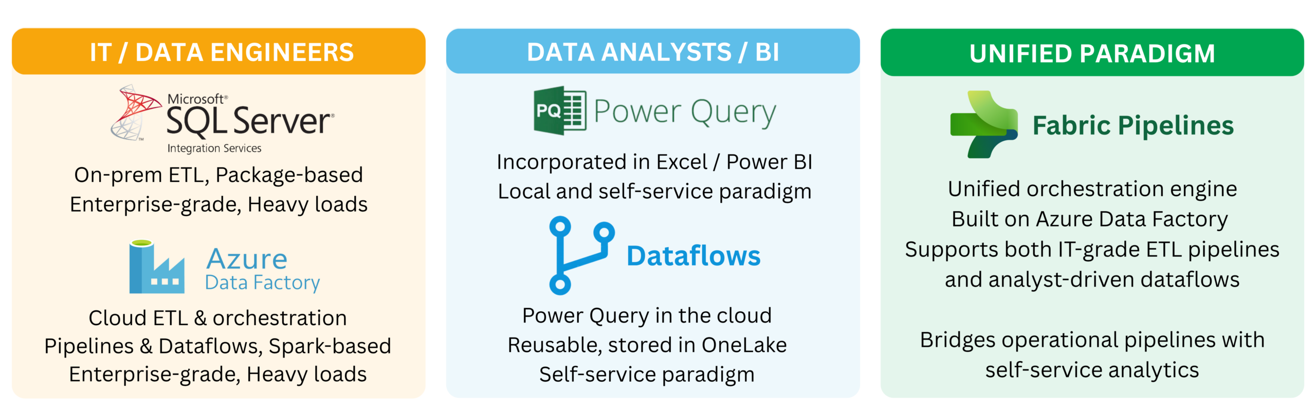
With SSIS everything centered around packages, large orchestrations built and deployed by IT, often scheduled overnight to load data warehouses or to transfer massive volumes between analytical and operational systems. It was powerful and robust, but also heavy. When Microsoft moved this approach to the cloud it became Azure Data Factory (ADF), a true cloud-native ETL service that can be seen as SSIS reborn in the cloud but with a broader scope, orchestrating data movement across databases, APIs, files, data lakes using Spark clusters.
In parallel, analysts got their own playground with Power Query. At first it lived in Excel, then in Power BI, where every report contained its own small ETL pipeline, isolated and duplicated across files. This quickly became unmanageable, since every analyst was reinventing the same transformations again and again and again. To address this, Microsoft introduced Dataflows, which are the same Power Query transformations but stored in the cloud. This brought reusability and governance, allowing teams to maintain one clean Customer table or any other shared entity, and reuse it consistently across multiple datasets and reports.
Fabric Pipelines represent the unification of Microsoft’s data integration story inside the Fabric ecosystem. They reuse the same orchestration model as Azure Data Factory but are fully integrated with OneLake, Dataflows, Lakehouses, Warehouses, and Datasets. Instead of juggling separate services or subscriptions, teams can now design, schedule, and monitor end-to-end workflows directly alongside their analytical assets. The goal is to bridge the gap between heavy engineering-grade orchestration and self-service analytics in a single platform. I don’t know if they will succeed but let’s see 😅.
3️⃣ The Data Connectivity Evolution
Import Mode and DirectQuery
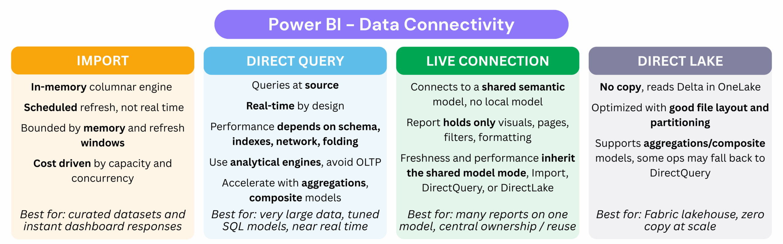
The first connection mode most Power BI developers encounter is Import Mode. In this mode the data is copied into VertiPaq, stored in memory, and optimized for speed. Dashboards feel fast and interactive because every calculation runs in memory, but there are trade-offs: refreshes must be scheduled, capacity is limited by available memory, and costs grow as datasets get bigger (for instance renting F128 / 50GB of memory in Power BI is $16,800/month; check SKUs prices here).
Here we are talking about renting memory in the cloud so that dashboards can stay responsive, but what about Power BI Desktop? When you run Import locally, you are simply using your own machine’s RAM. That is why Power BI developers prefer laptops with 32 GB or more 💻, because every import sits directly in local memory. A small but essential industry tip: always create a parameter called ReduceSize. When set to True, it limits your queries to a sample of around 10,000 rows so your laptop doesn’t crash. Once you publish to the Service, switch it back to False and let the full dataset load into cloud capacity.
The opposite is DirectQuery. Instead of storing data in memory, every user interaction sends a query back to the source system. This guarantees freshness but it also pushes all the load onto that source. Connecting directly to an operational system with DirectQuery is almost always a disaster, because those systems are built for transactions and not analytics. Now, to not be fascist about it, in very controlled environments, for example when you have read replicas or a formal agreement with the source team, you might get away with it, but those cases are extremely rare. DirectQuery works better on proper analytical platforms such as Synapse, Snowflake, or Databricks, as long as the volume remains reasonable and queries are performant. Why? We will check that in the “Let’s go deeper” section.
And between Import and DirectQuery, you also have Composite models. Instead of forcing the entire semantic model to use a single storage mode, Power BI lets you mix them in the same model. For example, you can keep small dimension tables or aggregated fact tables in Import for speed, while leaving a very large detailed fact table in DirectQuery to avoid loading everything into memory. This gives you a practical middle ground: fast performance for the queries users run most often, while detailed data remains available when needed. We’ll come back to this pattern later with aggregation tables and hybrid architectures.
Live Connection (and Shared Datasets)
Beyond Import and DirectQuery, Power BI also provides the Live Connection option. In addition, with the evolution of the platform, the concept of Shared Datasets was introduced, which is essentially the same principle as Analysis Services (AAS/SSAS) applied directly within Power BI Service (and now Fabric).
With Shared Datasets, when you build and publish a .pbix file (which contains both the report and the semantic layer) to the Power BI Service, it is automatically split into two components ✂️: the report itself (design, pages, charts) and the dataset (semantic layer: data, calculations, measures, RLS). This separation allows you to reuse the same dataset across multiple reports and dashboards, ensuring consistency, avoiding duplication, and simplifying management.
For instance, imagine you want to design different tiers of the same dashboard: 🥉 Bronze (showing 25% of KPIs), 🥈 Silver (covering 50% of KPIs), and 🥇 Gold (including 100% of KPIs along with detailed insights). Instead of rebuilding your semantic model three times and maintaining DAX changes separately, you can rely on a single semantic layer for your different reports.
This reuse is possible through a Live Connection, which connects reports to an existing dataset. The semantic layer contains the data, measures, calculation groups, and metadata, while you only focus on the report design. In this case, you would have one semantic layer and three reports.
Traditionally, this concept originated from Live Connections to Analysis Services (AAS/SSAS), which were widely used. In this setup, the cube managed modeling and query execution. Although you had no control over the model itself, you could connect Power BI directly to the cube, build your own visuals, and take advantage of a centralized, governed semantic layer.
Today’s Direct Lake with OneLake
OneLake is Microsoft’s new data lake foundation, built around open formats such as Delta and Parquet and designed to compete with platforms like Databricks and Snowflake.
With Direct Lake, Power BI can query data directly from OneLake without creating a full imported copy first. VertiPaq loads the columns it needs into memory on demand, so the first queries may be slower, while subsequent queries can run much closer to Import-mode performance once those columns are already loaded.
So, how much data can actually stay in memory? That depends on your Fabric capacity. The more memory you have, the more data VertiPaq can keep loaded and the less often it needs to go back to OneLake. And what happens when memory gets tight? Some data gets evicted and loaded again when needed. Simple as that. Personally, I haven’t used this yet, but that’s what Microsoft is promising us 😊 !
🤿 Let’s go deeper: Granularity, Cost, and Hybrid Models
Connecting Power BI in DirectQuery mode to an analytical platform like Snowflake, Synapse, or Databricks can be a great idea when data volumes are reasonable and queries are well-tuned. These platforms are built for analytics, so unlike operational systems, they can sustain a DirectQuery workload.
But don’t forget that your data platform layers (🟤 integration, ⚪ consolidation, 🟡 marts) live on disk-backed files in Parquet/Delta or on tables in your warehouse, and that’s perfectly fine. Bronze and Silver loads take minutes or even hours to process since they are heavy, and some Gold parts, for example those used to retrain ML models, also take time. But for dashboards, if we consume from a Gold layer that is cleaned and not too large, queries can return in just a few seconds, which is already good enough (⚠️ watch out for the 1M row limitation in DirectQuery).
The problem begins when your data marts start to show latency. At that point, you may need to switch to Import mode. But here’s the catch: you don’t want to import a 100 GB fact table into memory, unless you’re ready to pay a small fortune 💸.
Okay, and if we say we need a cube, should it simply mirror the Gold layer? Not necessarily. The semantic model should be designed around consumption patterns and cost, not just as a copy of storage.
So I will give you some options that work very well in practice:
- Change the granularity: If your Gold fact table is at the order line level, your cube can aggregate to the order level to reduce cardinality and memory usage.
- Use composite models: You can keep two fact tables using different patterns:
fact_ordersin Import mode as a pre-aggregated table.fact_order_linesin DirectQuery against Gold, for drill-through.- Executives get instant KPIs, while analysts accept slower queries for deep dives.
- Aggregation tables: Define an Import table for 90% of common queries, and let Power BI fall back automatically to DirectQuery for rare and high-detail explorations.
Data Connectivity Patterns
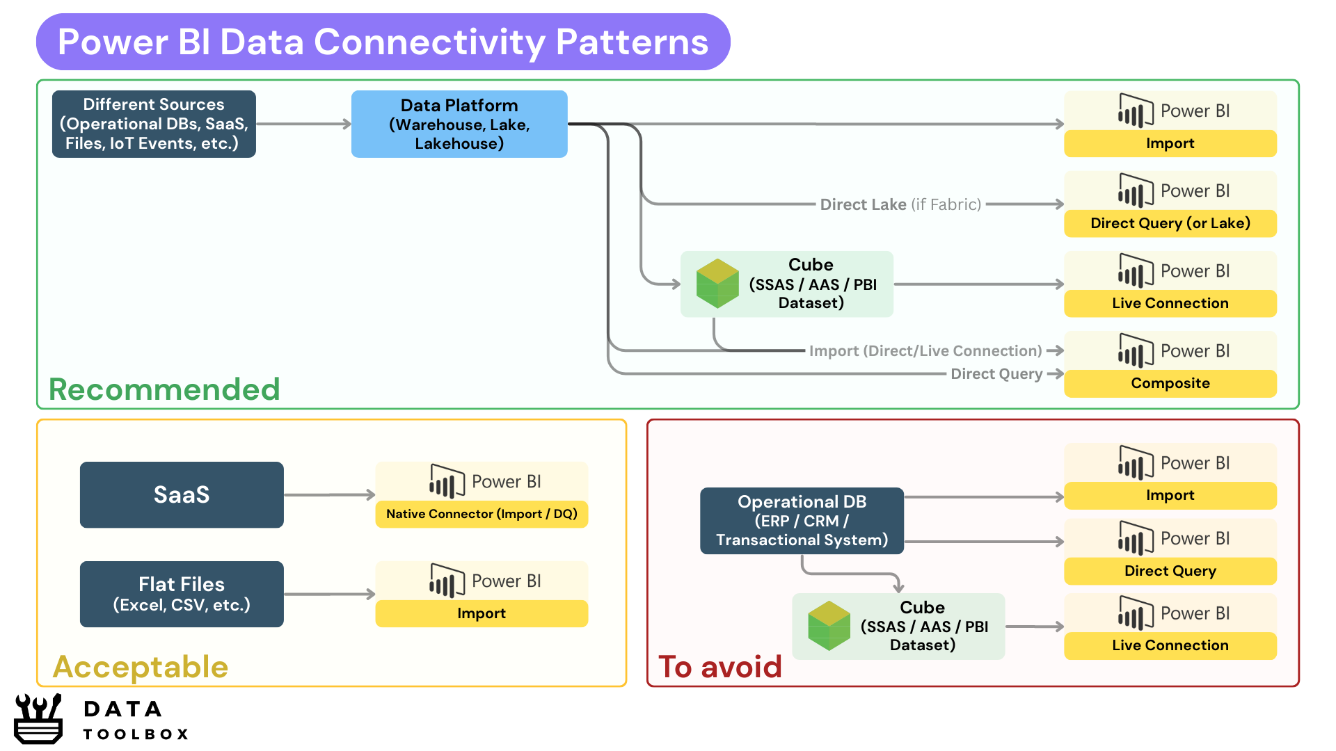
One canvas is worth more than ten chapters 🙃 – Yassine
4️⃣ The Reporting Evolution
From SSRS to Paginated Reports
In the 2000s, reporting was all about paginated outputs, reports with fixed layouts and page breaks, designed to be printed or exported as PDFs. What does that mean 📑? It’s the invoices, compliance documents and PDFs in your inbox every Monday at 8 AM. That was the world of SSRS (SQL Server Reporting Services). Great for finance or audit teams, but much more static than modern interactive BI.
Then came Excel dashboards 📊. People tried to force interactivity with pivot tables, slicers, and VBA, but Excel simply didn’t scale. Everyone ended up with their own version of “the truth” hidden in a .xlsx file on a shared drive. That mess is exactly what self-service BI set out to solve 💥.
Power BI’s reporting layer is the natural successor to SSRS, rebuilt for exploration rather than pagination. Instead of static PDFs, you now have interactive canvases where a single click can filter millions of rows, reveal customer details, or shift perspectives instantly. Reporting stopped being a one-way street, it became a real conversation with the data.
From Dashboards to Interactive Analytics
To summarize 📌! Power BI reporting isn’t about dumping 20 visuals on a page. It’s about creating clean and purposeful interfaces to the semantic model.
Here are a few key principles to keep in mind:
- Report Pages: one page = one story. Don’t overload users with endless KPIs.
- Navigation & Bookmarks: reports should feel like apps, guiding users instead of leaving them lost.
- Custom Visuals: great add-ons, but poorly optimized visuals can hurt performance.
- Mobile layouts: often overlooked, but they can be useful in certain contexts (for example, blue-collar workers working outside).
- Paginated Reports: still alive in Power BI when you need pixel-perfect outputs for printable documents (invoices, regulatory docs, etc.).
Conclusion

Alright my friend, if you made it all the way down here, respect 👊. You can already flex at the coffee machine by talking about the difference between SSIS and Power Query, or casually throwing out that VertiPaq is in-memory and not on disk.
But let’s be real, you’re not a Jedi Master yet ⚔️. This was just the warm-up, the real fights are still ahead: modeling (DAX, filter vs row context mind games, hidden cost traps) and adoption (where you discover the hardest problem isn’t tech, it’s… people 😂).
👉 Not 100% ready for the PL-300 yet? Fair. But you ARE ready to see how RLS, SCDs, and fact tables actually get built in production check the blueprints here!